Master Quick Analysis Tool Excel: Expert Tips & Tricks
Need to smarten your data game in Excel? Meet the Quick Analysis Tool Excel. This powerful feature can swiftly transform your raw data into insightful visualizations and trends. Say goodbye to tedious calculations and hello to instant data interpretation. Excel’s Quick Analysis Tool is your shortcut to unlocking valuable information within your spreadsheets. Ready to supercharge your analysis? Let’s dive in!

Unlocking Efficiency with the Quick Analysis Tool in Excel
Welcome, young analysts and spreadsheet enthusiasts! Today, we’re diving into the wonderful world of Excel and uncovering the magic of the Quick Analysis Tool. If you’ve ever found yourself buried under a mountain of data, unsure of where to start or how to make sense of it all, fear not! This handy feature in Excel is here to save the day. So grab your favorite snack, put on your thinking cap, and let’s embark on this exciting journey together!
What is the Quick Analysis Tool?
Before we jump into the nitty-gritty details, let’s first understand what the Quick Analysis Tool actually is. Think of it as your trusty sidekick, your virtual assistant within Excel that helps you analyze and visualize your data with just a few clicks. Instead of spending hours manually formatting and creating charts, the Quick Analysis Tool streamlines the process, allowing you to make sense of your data quickly and efficiently. It’s like having a superpower right at your fingertips!
Accessing the Quick Analysis Tool
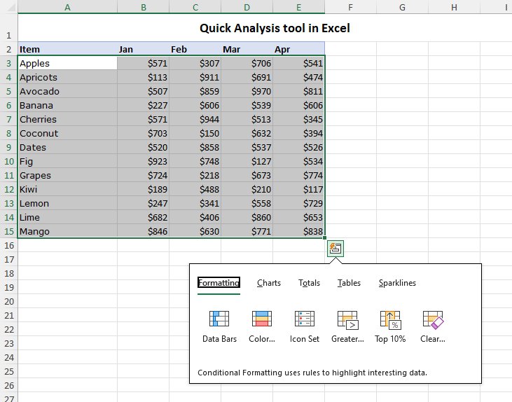
Now that you know what the Quick Analysis Tool can do, let’s learn how to access this powerful feature. It’s as easy as pie! Simply select the data you want to analyze in your Excel spreadsheet. Next, look for the small icon that appears at the bottom right corner of your selection. Click on it, and voila! The Quick Analysis Tool menu will pop up, offering you a variety of options to explore and analyze your data in different ways. It’s like uncovering a treasure trove of possibilities!
Five Amazing Features of the Quick Analysis Tool
1. Formatting: Say goodbye to boring, plain data tables! With the Quick Analysis Tool, you can instantly apply sleek and professional formatting styles to your data, making it visually appealing and easy to read.
2. Charts: Charts are a great way to visualize data and spot trends at a glance. With the Quick Analysis Tool, you can create beautiful charts like bar graphs, pie charts, and line graphs with just a few clicks. Impress your friends and teachers with your data visualization skills!
3. Tables: Need to summarize your data in a neat table? The Quick Analysis Tool has got you covered. You can quickly convert your data into a structured table format, making it easier to analyze and share with others.
4. Totals: Calculating totals and averages can be a hassle, especially with large datasets. But fear not! The Quick Analysis Tool can instantly calculate totals, averages, and other key metrics for your data, saving you time and brainpower.
5. Sparklines: Ever heard of sparklines? These tiny, mini-charts provide a quick visual representation of your data trends within a single cell. With the Quick Analysis Tool, you can easily add sparklines to your spreadsheet and impress everyone with your data analysis skills!
Practical Examples and Use Cases
Now that you’ve got a grasp of the amazing features the Quick Analysis Tool offers, let’s dive into some practical examples and use cases where this tool can truly shine.
Example 1: Sales Performance Analysis
Imagine you’re tasked with analyzing the sales performance of a fictional company over the past year. You have a massive spreadsheet filled with sales data, including revenue figures, product categories, and sales regions. Instead of manually crunching numbers and creating charts from scratch, you can use the Quick Analysis Tool to instantly generate insightful charts and tables that highlight key sales trends, top-selling products, and revenue growth over time. With the click of a button, you’ll impress your boss and colleagues with your data analysis prowess!
Example 2: Budget Tracking and Analysis
Let’s say you’re managing your allowance or tracking your expenses for a school project. With the Quick Analysis Tool, you can quickly format your budget data, create visual pie charts to show your spending categories, and calculate your total expenses for the month. This not only helps you stay organized but also improves your financial literacy skills by visualizing where your money is going. Who knew budgeting could be so much fun?
Unlock Your Data Superpowers with the Quick Analysis Tool
As we wrap up our exploration of the Quick Analysis Tool in Excel, I hope you’ve discovered the endless possibilities and efficiencies this tool can bring to your data analysis adventures. Whether you’re a budding data scientist, a curious student, or a spreadsheet wizard, the Quick Analysis Tool is your secret weapon for unlocking insights and making sense of complex data sets. So go ahead, unleash your data superpowers, and conquer the world of Excel with confidence!
Remember, the Quick Analysis Tool is not just a feature; it’s a gateway to a world of data exploration and discovery. So the next time you find yourself staring at a sea of numbers and wondering where to begin, just remember: the Quick Analysis Tool has your back!
Happy analyzing!
The Excel Quick Analysis Tool
Frequently Asked Questions
What is the quick analysis tool in Excel?
The quick analysis tool in Excel is a feature that allows users to quickly analyze and visualize data without the need for complex formulas or functions. It offers various options for formatting, charting, and summarizing data to help users make sense of their datasets easily.
How can I access the quick analysis tool in Excel?
To access the quick analysis tool in Excel, simply select the data range you want to analyze. Then, look for the small icon that appears at the bottom right corner of the selected range. Click on this icon to open the quick analysis tool menu.
What types of analysis can be performed using the quick analysis tool in Excel?
The quick analysis tool in Excel offers various analysis options, such as formatting, charts, totals, tables, and sparklines. Users can quickly apply conditional formatting, create charts, calculate totals, and generate mini tables or sparklines to visualize data trends.
Can I customize the analysis options provided by the quick analysis tool in Excel?
Yes, users can customize the analysis options provided by the quick analysis tool in Excel to suit their specific needs. For example, they can choose different chart types, apply specific formatting rules, or select which data elements to include in the analysis.
Final Thoughts
In conclusion, the Quick Analysis tool in Excel streamlines data analysis, saving time and improving efficiency. With just a few clicks, users can visualize trends, apply formatting, and generate insights. This powerful feature is essential for anyone looking to make sense of their data quickly and effectively. Utilizing the Quick Analysis tool in Excel can greatly enhance your productivity and decision-making processes.